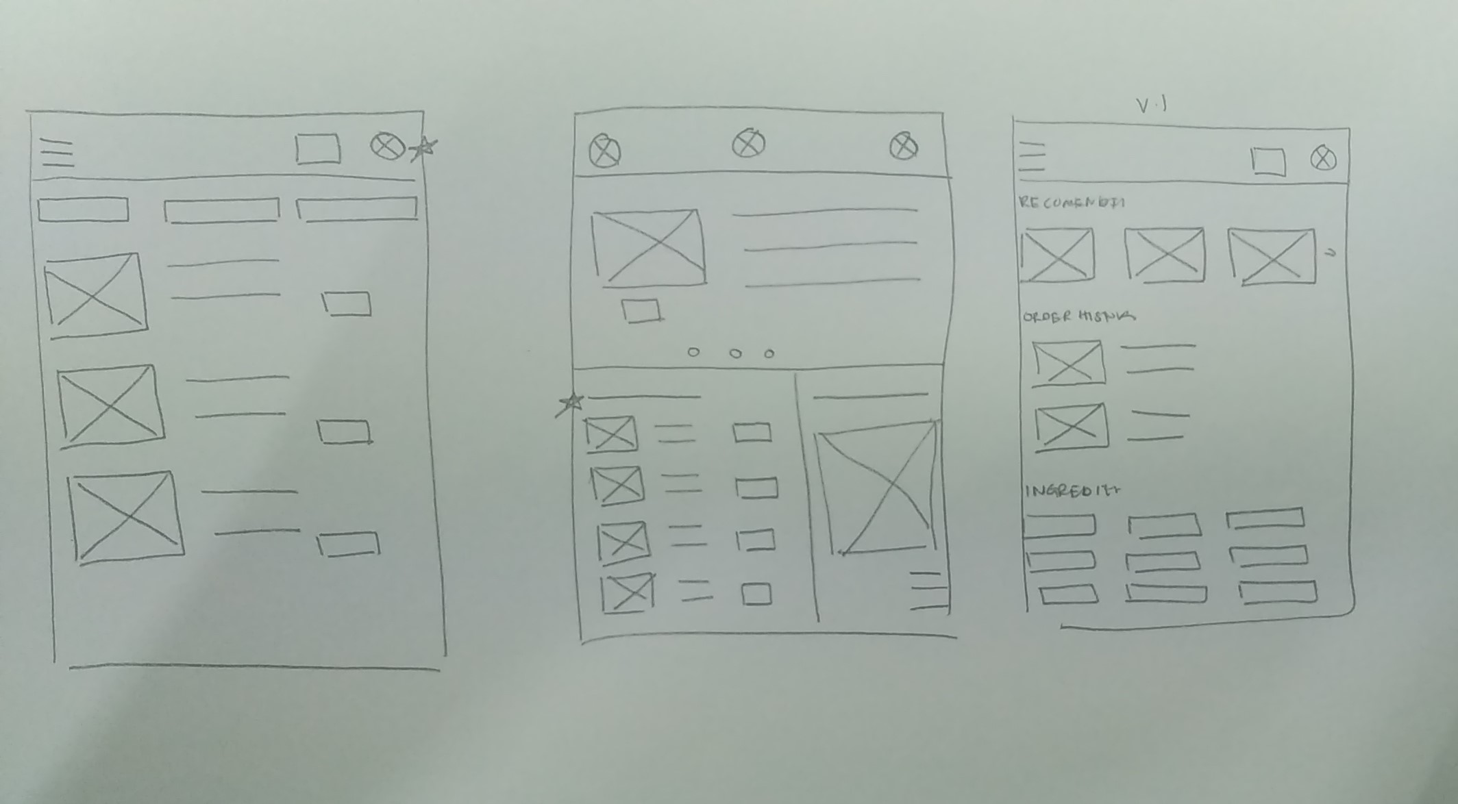
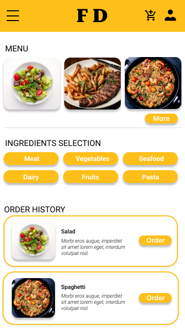
Paper wireframes
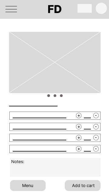
Digital wireframes
Low-fidelity prototype
.png)
Usability study
I conducted two rounds of usability studies. Findings from the first study helped guide the designs from wireframes to mockups. The second study used a high-fidelity prototype and revealed what aspects of the mockups needed refining.
Round 1 findings
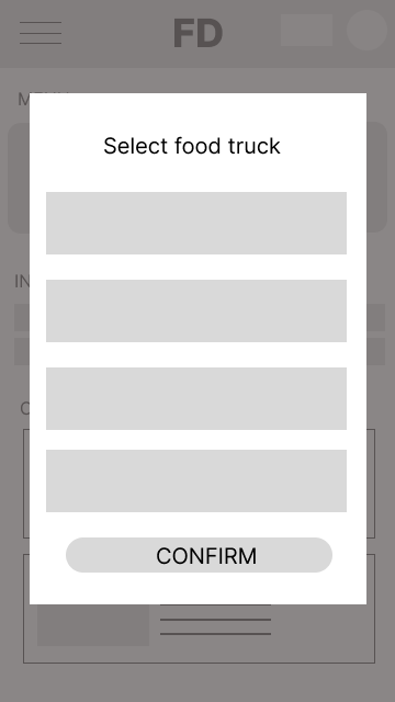
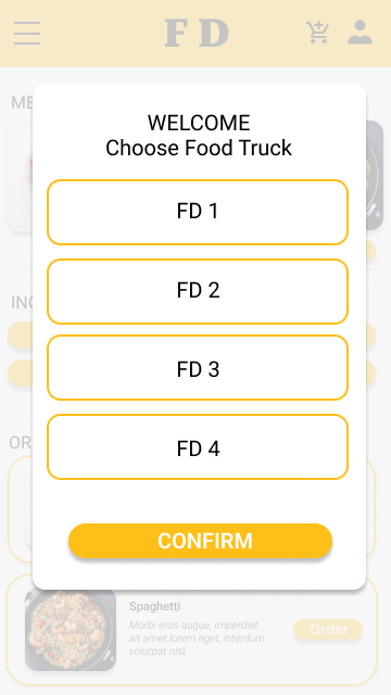
Users want to select different truck food location.
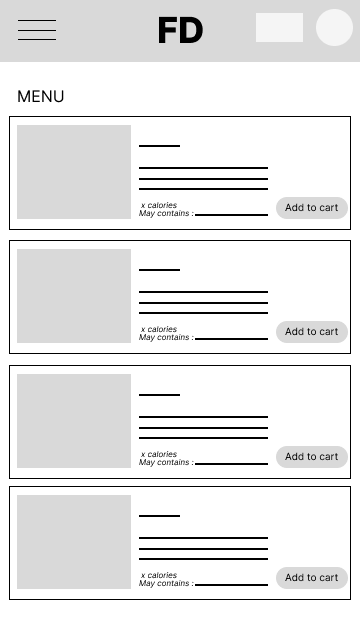
Users want simple way to customize food ingredients.
Users want multiple payment options.
Round 2 findings
Users want back button to easy navigation
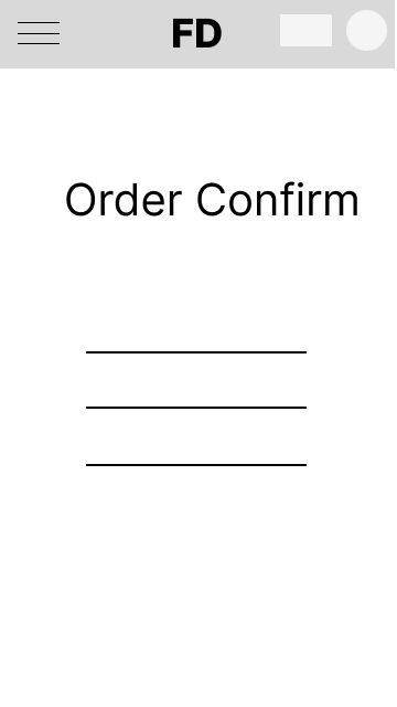
No option back to home at order confirmation
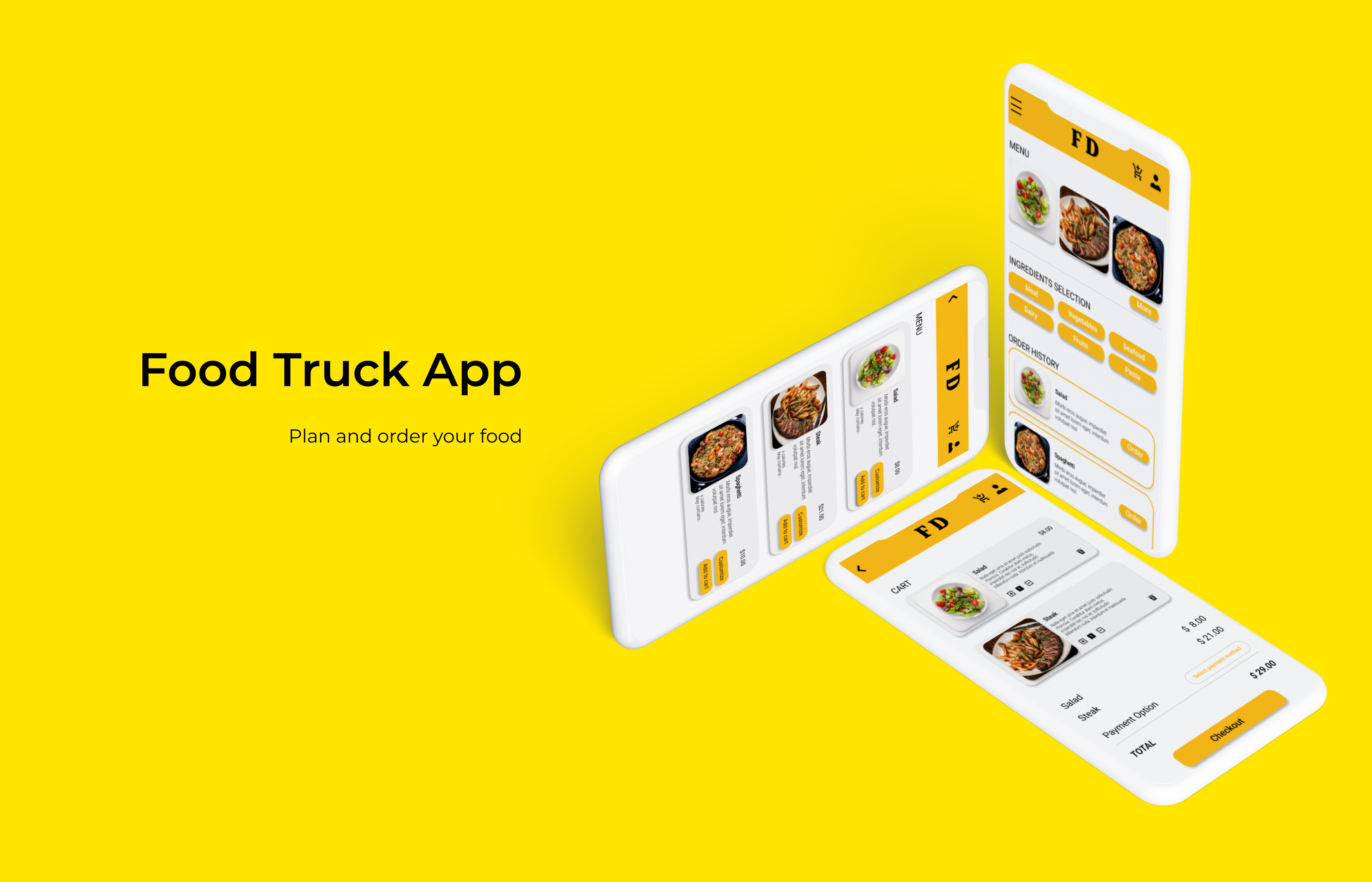
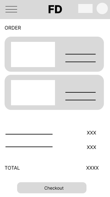
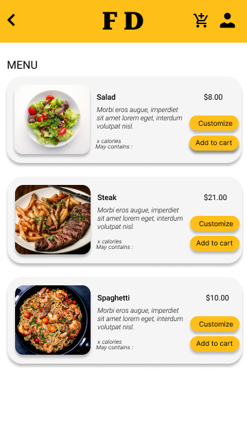
Mockups
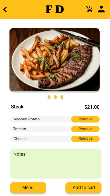
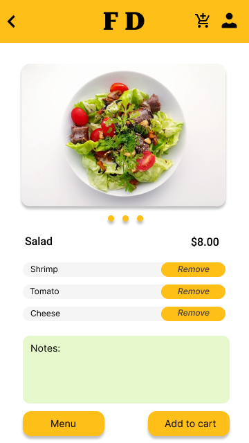
High-fidelity prototype
.png)
Accessibility considerations
Used icons to help identify the action or navigation easier
Added swipe action and click button
Used multiple and clear images with labels for easy access and understanding.
Takeaways
Impact
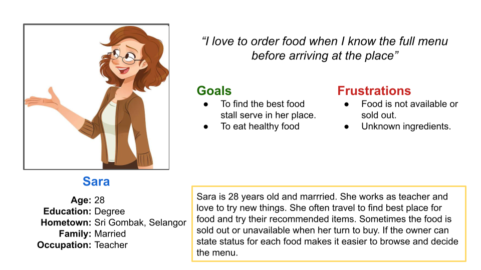
The app help users control and monitor their food intake.
One quote from peer feedback
“The app is easy to use. The menu is clear to read and I can customize the food according to my taste.”
What I learned
While designing the FD app, I have learned that the smooth flow is important for users experience. Each usability's studies helps to identify the problems arise and revise the design based on the feedback.
Next steps
Conduct another round of usability studies to validate whether the pain points users experienced have been effectively addressed.
Search for better way to categorize the food section to help users choose wisely.
.png)